Tableau Analytics
We have included a new tab in the side panel for workspaces that have opted into Tableau reporting. You can now embed your Tableau dashboard directly in your workspace.
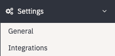
To set this up, an organization admin can head to the Settings dropdown and click Integrations.
A page will appear with a number of options. Select Tableau. 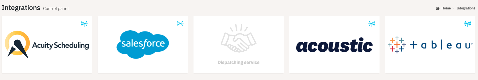
Next you will paste your Tableau login URL (log into your Tableau dashboard separately, and copy the URL from the browser bar).
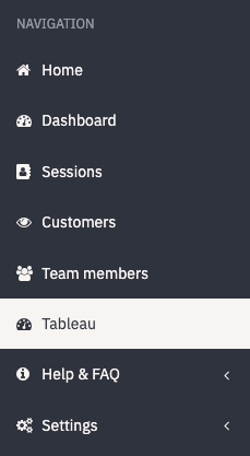
A new tab named Tableau should appear on the Navigation panel that will allow you to view your dashboard from directly within your workspace.
If you have questions about how to set it up, or are interested in activating your own Tableau dashboard, email support or speak to your Customer Success Manager.
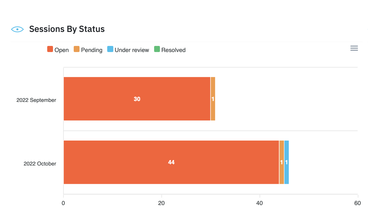
Sessions by Status
This chart lets you see how many sessions in your workspace are categorized as Open, Pending, Under Review, or Resolved.
Using this information you can track the success of your virtual service program, and gain some visibility into the accuracy of your session categorization.
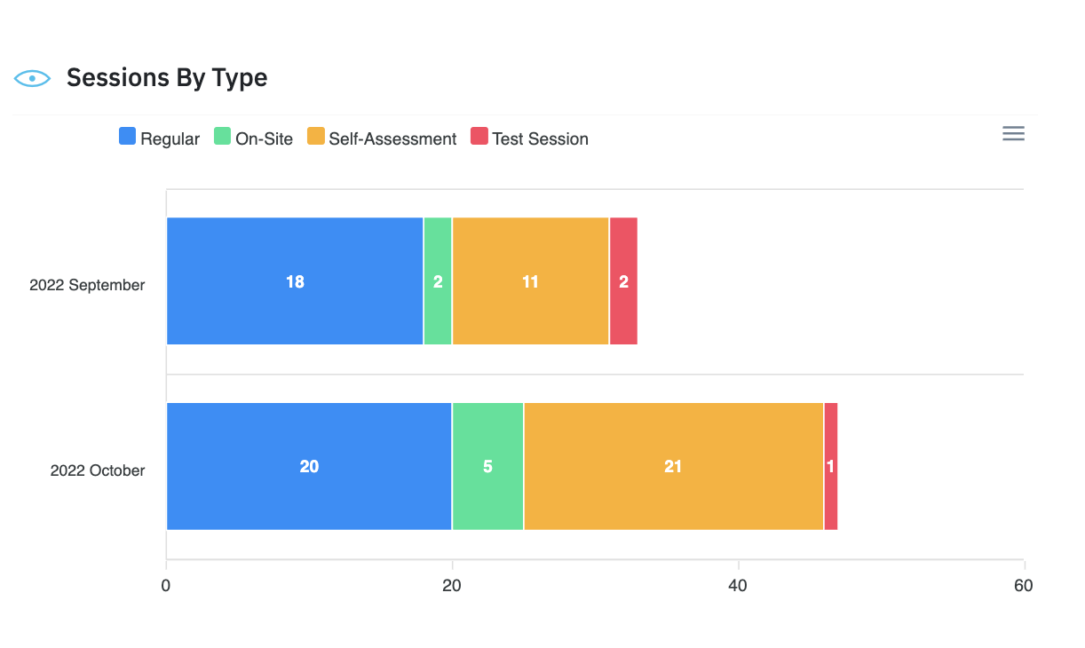
Sessions by Type
This chart provides a summary of the different types of sessions that were completed in a given time frame. Regular sessions are your live sessions. On-site are user sessions completed solo. Self-assessment are customer sessions completed solo. Test sessions are used to determine whether your settings will work properly in a live environment.
Filtering
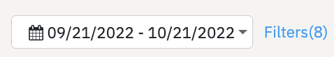
Users have a number of options to filter the sessions displayed in these dashboard charts. At the top of the page you can define the date range that you would like to view.
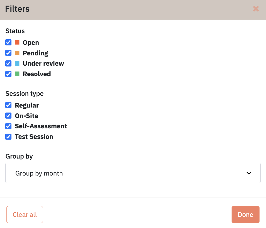
By clicking on the Filters button, a number of other options appear. Users can filter sessions by status or session type.
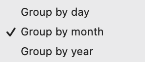
Users can also click the drop down menu to group sessions by day, month, or year. This makes it easier for you to compare data from week to week, month to month, or year to year.
Note: If too large of a date range is selected (ie. group by day over two months) the data may be hard to read. Please select a smaller date range for your comparison to prevent this.
To view a summary of how dashboard metrics are calculated, please consult this knowledge base article.